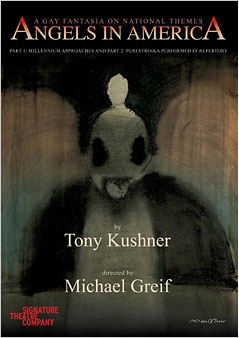
The New York Times reports that a design has been chosen for the new Angels in America poster at the Signature this fall. This is what it looks like:


I don't know. Something about it loses the abstractness that I like about the original. What could improve it. Hmm...
 Ah, much better.
 Ah, much better.


1 Comment